
Just about the worst thing a book jacket designer can do is, in my opinion, depict any of the characters on the cover. It seems almost a cruel thing to do, like he’s stealing imaginative power from the reader before the reader even gets to open the book. Story writing, by its nature, engages the imagination, but the imagination loves shortcuts, and any cover-art with a character in it is like a pizza delivery guy showing up when the author has spent hours cooking up a gourmet meal of prose. (Now, if you’ll please forgive that metaphor and read on …)
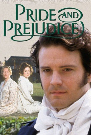
I’ve been victimized by this phenomenon myself: Harry Potter is either Daniel Radcliffe, or that dopey-looking kid on the American editions. Sherlock Holmes is this guy, even if I picture him in period dress. And no matter how skillfully Jane Austen may describe Mr. Darcy, he’s Colin Firth. He just is. Also, I deeply regret that I only read Lolita after seeing the execrable Adrian Lyne-directed film adaptation, because Humbert Humbert is Jeremy Irons, even though he really, really shouldn’t be, and I don’t want him to be.
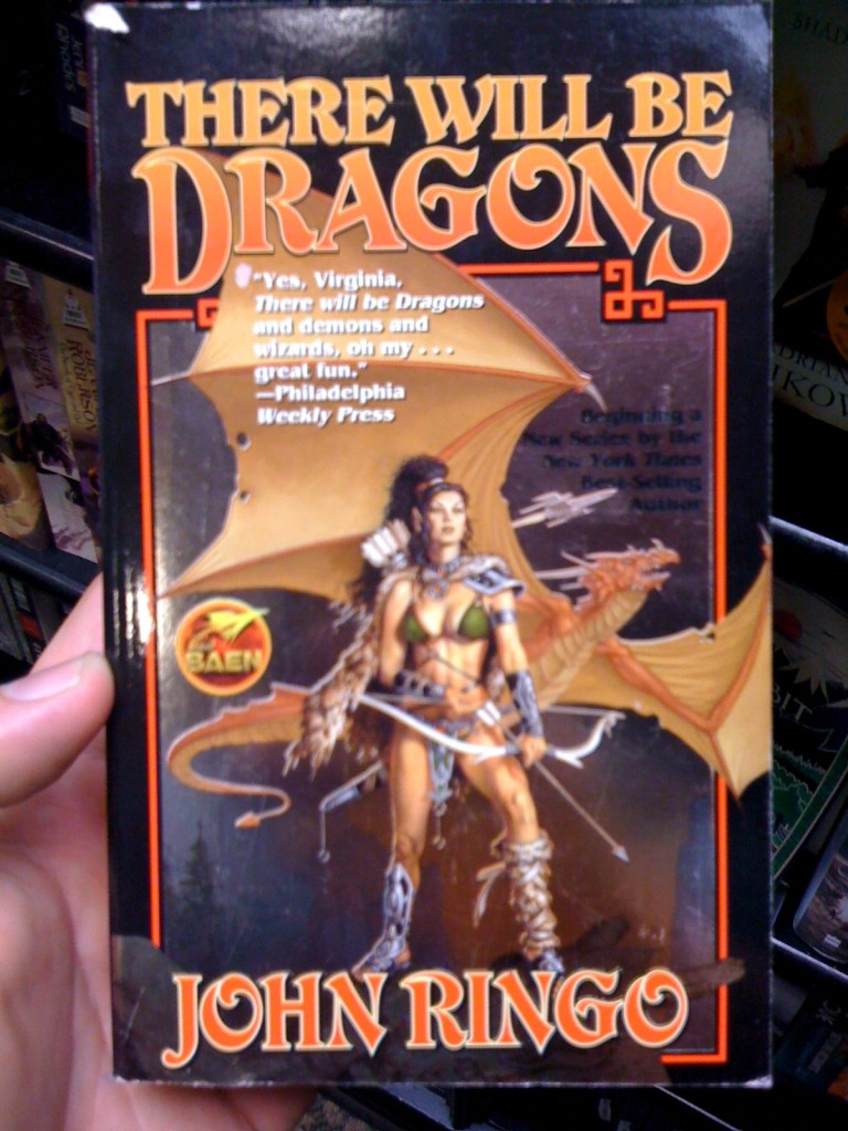
Recent Streetlight interviewee Kristen-Page Madonia managed to escape this with her YA novel Fingerprints of You (available in stores!), featuring a more elemental cover of a tattoo received by a character early in the book. Which is lucky for her, as Young Adult books are one of the most common victims of the characters-on-the-cover curse. But an even worse genre for this crime is genre-fiction, especially fantasy/sci-fi fiction, which is ironic considering the great lengths of so many of those books reach. Sure, the author may spend 1,000 pages building a whole world up out of nothing but words, but here’s the hero on the cover, shooting lasers or swinging a sword at whatever the evil creature is, or the heroine looking sexy-yet-strong with her hip sticking out way too far, and in an outfit that doesn’t look like it would hold up well in battle.
I understand the need for marketing in a very competitive field, but when you have things like book trailers, as a serious reader you feel the urge to rebel. So here is my radicalist proposal: Starting now-ish, all books will have plain white covers, with only the titles and author’s name on the cover. In Helvetica. And that’s it. If you want more, you’re gonna have to read the book. And use your imagination.
Follow us!Share this post with your friends.